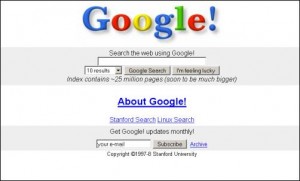
If you live on the internet and do not happen to spend all of your time on Facebook, you may have noticed that the web is getting a bit of a redesign lately. I’m referring to the half dozen web properties that have either been released or updated by Google in just the last two months. Pretty interesting when you recognize that Google lived for years as one of the most basic and “design free” companies on the web: its search engine was the definition of minimalist, the focus was on information pure and simple.
However, as people spend more time online and more of that time is social and interactive (rather than just informational) Google seems to be devoting some of its 35,000 or so employees to making the web a pretty place to rest your eyes. This doesn’t mean they’ve lost track of their minimalist roots (far from it), but there is certainly some serious pixel pushing going on at Google. I for one, like what I see.
Here’s the roundup, in the order in which I noticed the changes:
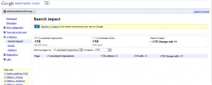
Webmasters – This was a very minor update, but gave a preview of things to come. Easier access to lots of website profiles, faster scripting, and nice use of larger screens.
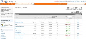
Analytics – This is where it starts to get interesting, and deserves a screenshot comparison. Notice not only the complete design upgrade, but also the smooth rollovers and subtle shadings. Better contrast makes it easier (for my old and tired 31 year old eyes) to stare at analytics, at least.
I also like the “Create New Dashboard”. Why, yes, thank you I will.
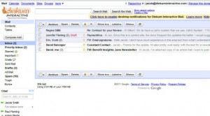
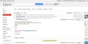
Gmail / Google Apps – You have to dig a little to see the new Gmail and Google Apps interface, mainly because it is not yet active by default. Take a spin over to “settings” and choose either “Preview” or “Preview (dense)”. Notice the greater reliance on white space, among other things.
Search Interface – This is my favorite refresh, mainly because I was so incredibly bored with the last version. I arrived each day hoping only that I would see a new Google Doodle. I have to give credit to the Googler that suggested to his designer friend: “Hey, why don’t you put a big black bar up top of every page on most of the internet. I think that would look good.” It not only looks good, but as a Google property user it really helps to tie my experience together as I shift around different apps. Here’s hoping they roll it out to all services in the near future. I feel that the page is under dressed without it.
Google Plus – El Goog’s latest foray into Social Media is nothing less than a major design coup, in my opinion. Add in the obvious benefits of circles and you have a pretty strong offering to compete with Facebook, LinkedIn and the other social networking sites. That is, if they can actually get people to use it. One reason this might just work is the iconography. A comparison between Facebook and Google Plus icons is a revealing exercise.
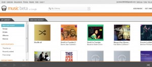
Google Music – This is the youngest of the bunch, both in terms of entry to market and also overall vibe. I’m reacting in a positive way because I couldn’t be more tired of Apple’s iTunes, and Amazon’s design aesthetic doesn’t live up to its Cloud Drive leadership.
So what is this all about? Google says:
The way people use and experience the web is evolving, and our goal is to give you a more seamless and consistent online experience—one that works no matter which Google product you’re using or what device you’re using it on. The new Google experience that we’ve begun working toward is founded on three key design principles: focus, elasticity and effortlessness.
I think it’s about one thing: Google versus Facebook. More on that in future posts as we chronicle the epic battle between these two web giants.
http://googlesystem.blogspot.com/2011/06/googles-new-interface.html
http://googleblog.blogspot.com/2011/06/evolving-google-design-and-experience.html


