 It’s a cold, hard fact: people spend about 4 seconds looking at your website before deciding whether to stay or leave. So how can you hook visitors in that 4 seconds?
What’s going on Above The Fold?
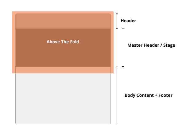
Above the Fold – or ATF – is a graphic design concept that says the most important information should be visible to a user without them having to scroll down the screen. In newspaper terms, it’s the headline you see before the fold along the middle of the page of a broadsheet. Its purpose is to get your attention so you buy the newspaper.
It’s the same with website design. ATF should display the most visually appealing image, or information, so that users (buyers) are attracted when they land on the page. This is your prime real estate – your attention grabbing headline, so make it count.
So, where exactly is the fold? It’s measured by monitor screen height minus the browser toolbar, browser’s tab height, and so on. Of course, the amazing number of device sizes and screen resolutions (as well as changing user behavior) is quickly making this a moveable line. It usually includes your header and master header/stage.

Clients love keeping information ATF, but often have difficulties making choices. They often want a bigger logo and taller master header, or want to pack more information or images into the prime real estate and consequently create an unnatural ATF stop.
Unlike the real world where a meeting with an actual person allows you to make a judgment about appearance, dress, posture, and manner, this is not the case with a website. You’ve only got those 4 valuable seconds to attract the visitor’s click. If you don’t focus that attention, your nicely designed website could end up with low engagement, high bounce rate, and lower page views. The ugly duckling.
Don’t believe me? Use clicktale.com on your website and you’ll be able to see exactly what users do, and don’t do, when they visit your homepage.
My quick, rescue tips for a weak ATF include:
- Shorten the header by utilizing a smaller logo and tall main navigation. Keep them side by side for the greatest efficiency.
- Dramatically decrease the master header height, use words, and leverage a great illustration or photograph that captures attention. Check out these examples.
Finally, visit your website with the mindset of a customer or client. Do you like what you see?
Photo Credit: http://www.sxc.hu/photo/981362


5 Replies to “You’ve Got 4 Seconds: How to Hook Web Visitors”